
Client: Raskolnikow & Sonja
Year: 2022
Scope: Postcard for ADV
About the festival
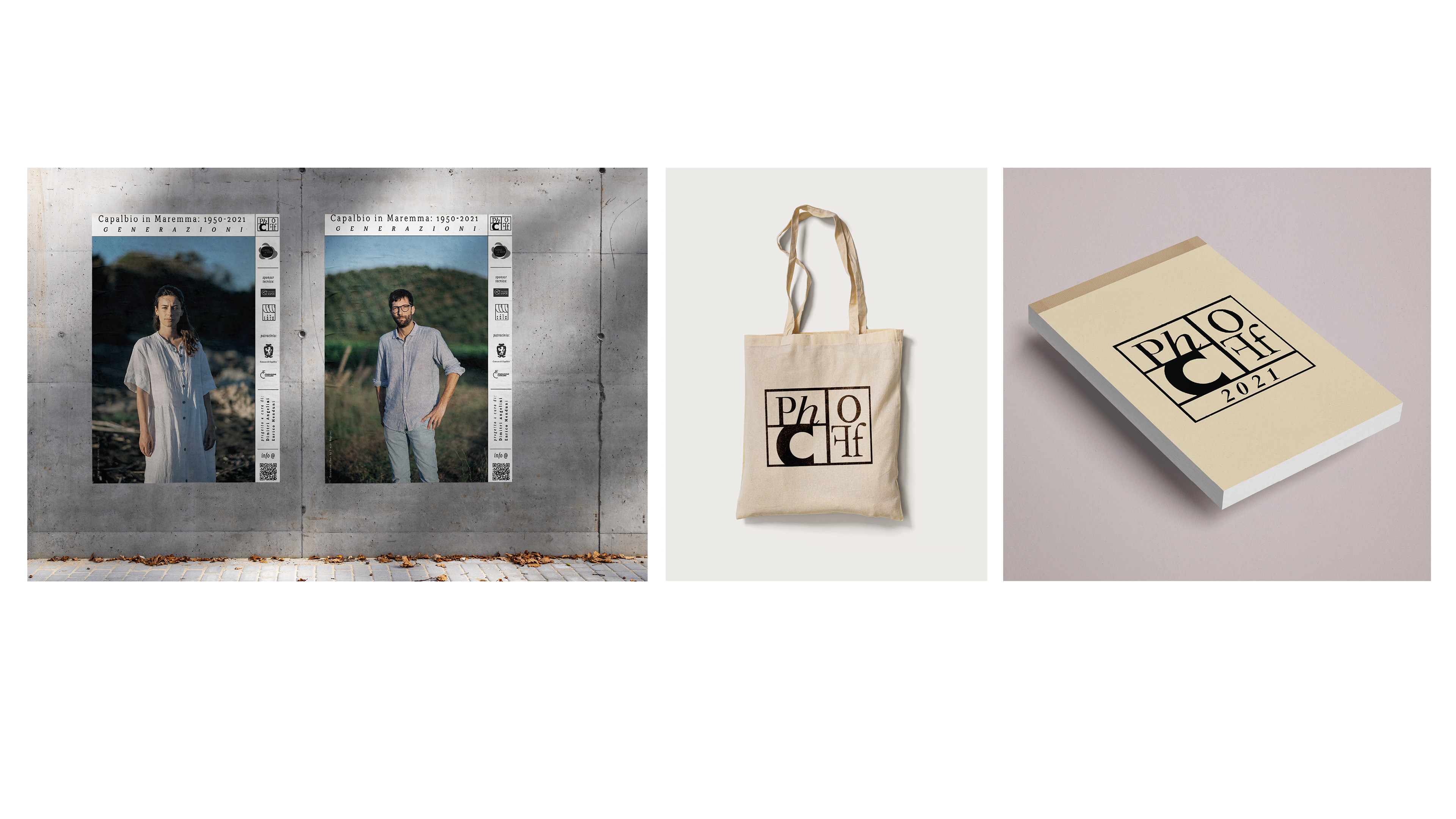
PhC CapalbioFotografia is an International Contemporary Photography Festival in Capalbio. The festival has been held over the last 15 years in Capalbio a historical town in South Tuscany. The mission is to initiate and support innovative work by both established and emerging artists that will advance the understanding of the varied meanings, functions and significance of photography and related media. PhC CapalbioFotografia has exhibited works by notable figures such as Don McCullin, Tim Davis, Leonie Purchas, Matthew Monteith, Graciela Iturbide, Anders Petersen, David Spero, Bernard Plossu and many others. The festival and workshop aspires to bring together both established and emerging talent, who will work together to consider not only local realities, but also national and international dynamics. Since 2021 the PhC have created the "off-section" for young photographers and for site-specific and "en plein-air" new projects.
About the concept
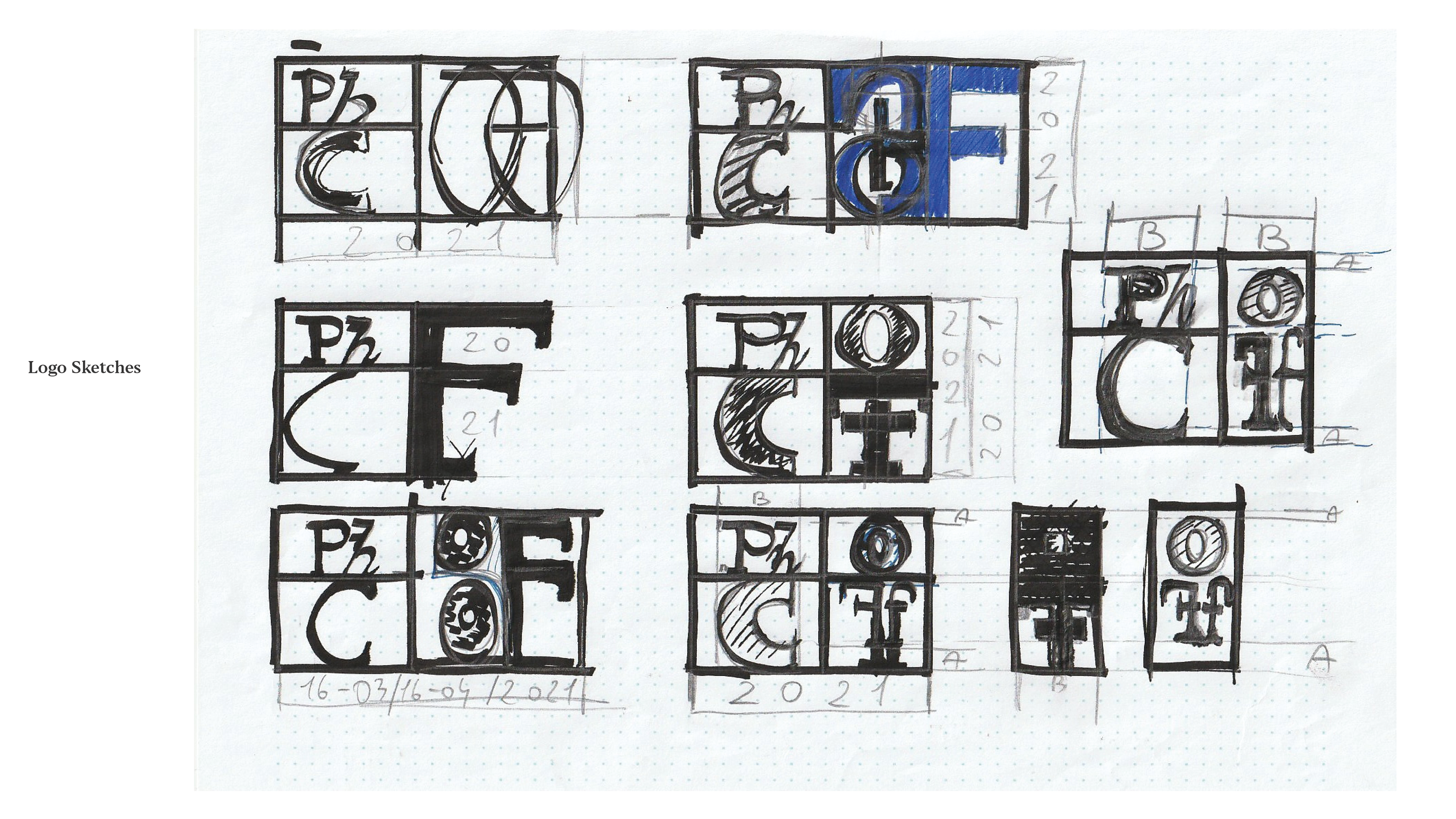
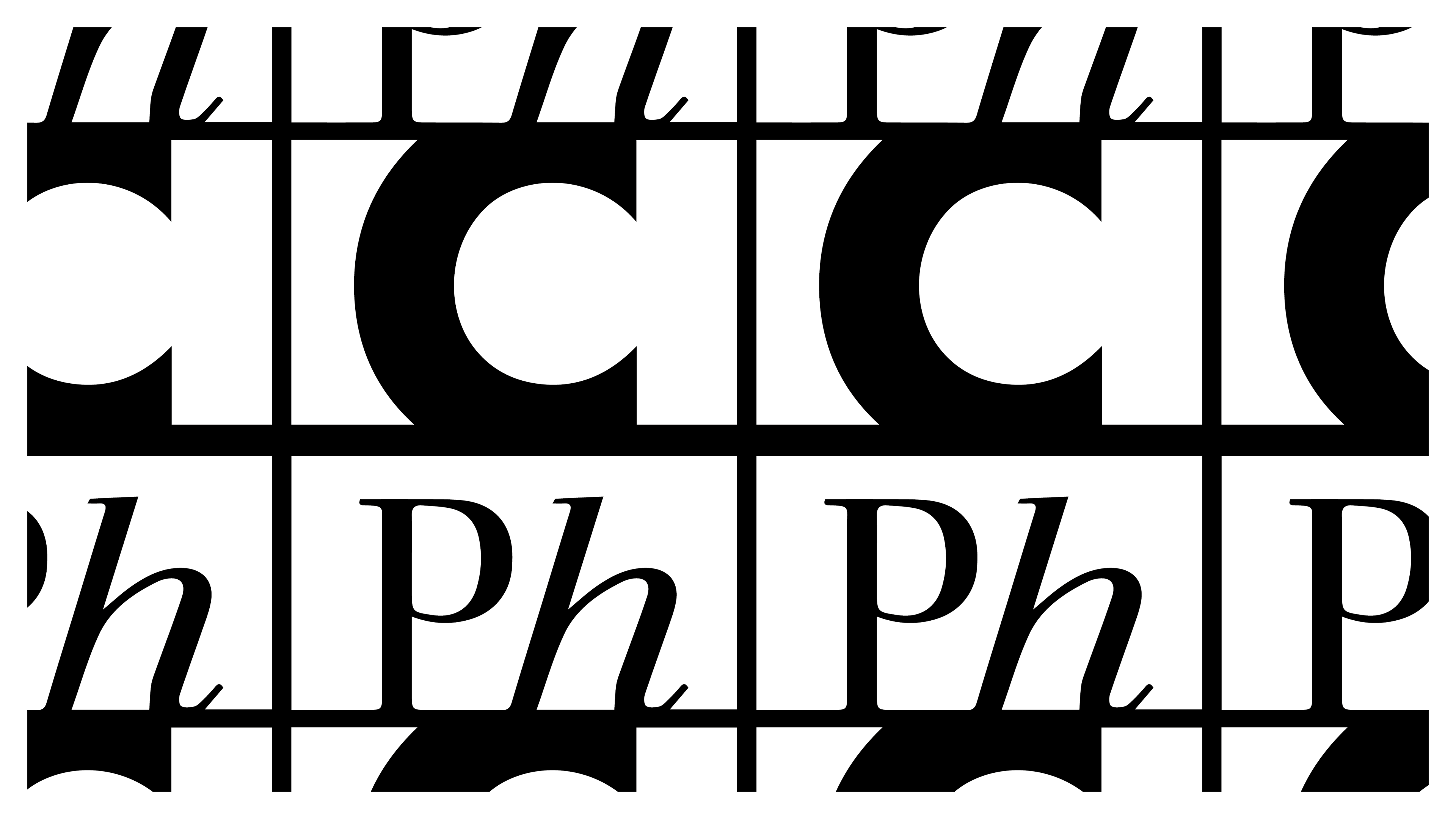
The original logo was created in 2009 by Inarea, a design studio founded by Antonio Romano, which operates worldwide in the field of Identity Design. During 2021, the PhC expanded with the 'off' section, and was therefore asked to create a logo that would be a continuation and integration of the original logo, without creating substantial differences, but which could have an immediate graphic and perceptual continuity. The new logo had to inspire a look back at the craftsmanship of the past and connect with modernity to the institutional logo, which uses very modern and minimalist lines. For this reason, it was decided to integrate the institutional logo with the new one, which had to recall a link between past and present. The integration was realised with a logotype of the word 'OFF', so as to continue the visual identity of the main part of the festival logo. Using the Garamond font, generally known as humanist. The choice of this typeface Contemporary reinterpretations of historical typefaces were designed to respect modern technology and today's requirements for sharpness and uniformity. This typeface was chosen to create the new part of the logo, as it deviates from the sans-serif typeface of the main logo, we wanted to give a broader vision describing photography as a contemporary artistic practice and craftsmanship.