
Client: Concept for a cosmetic brand
Year: 2023
Scope: Brand Design, Identity
About the brand
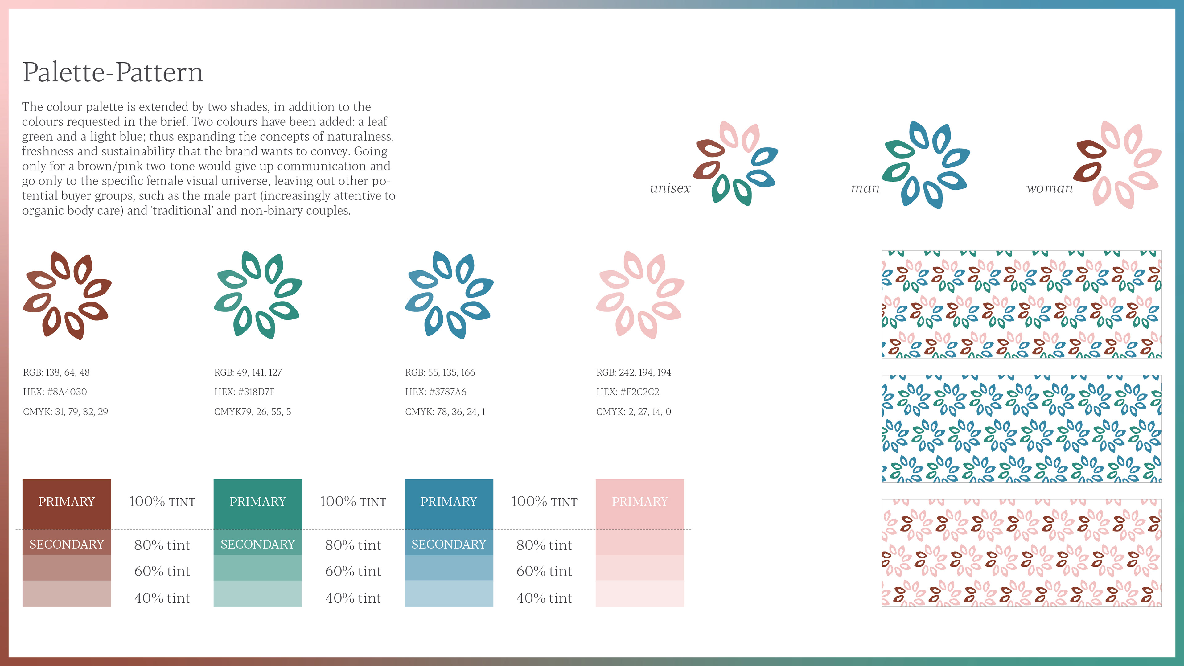
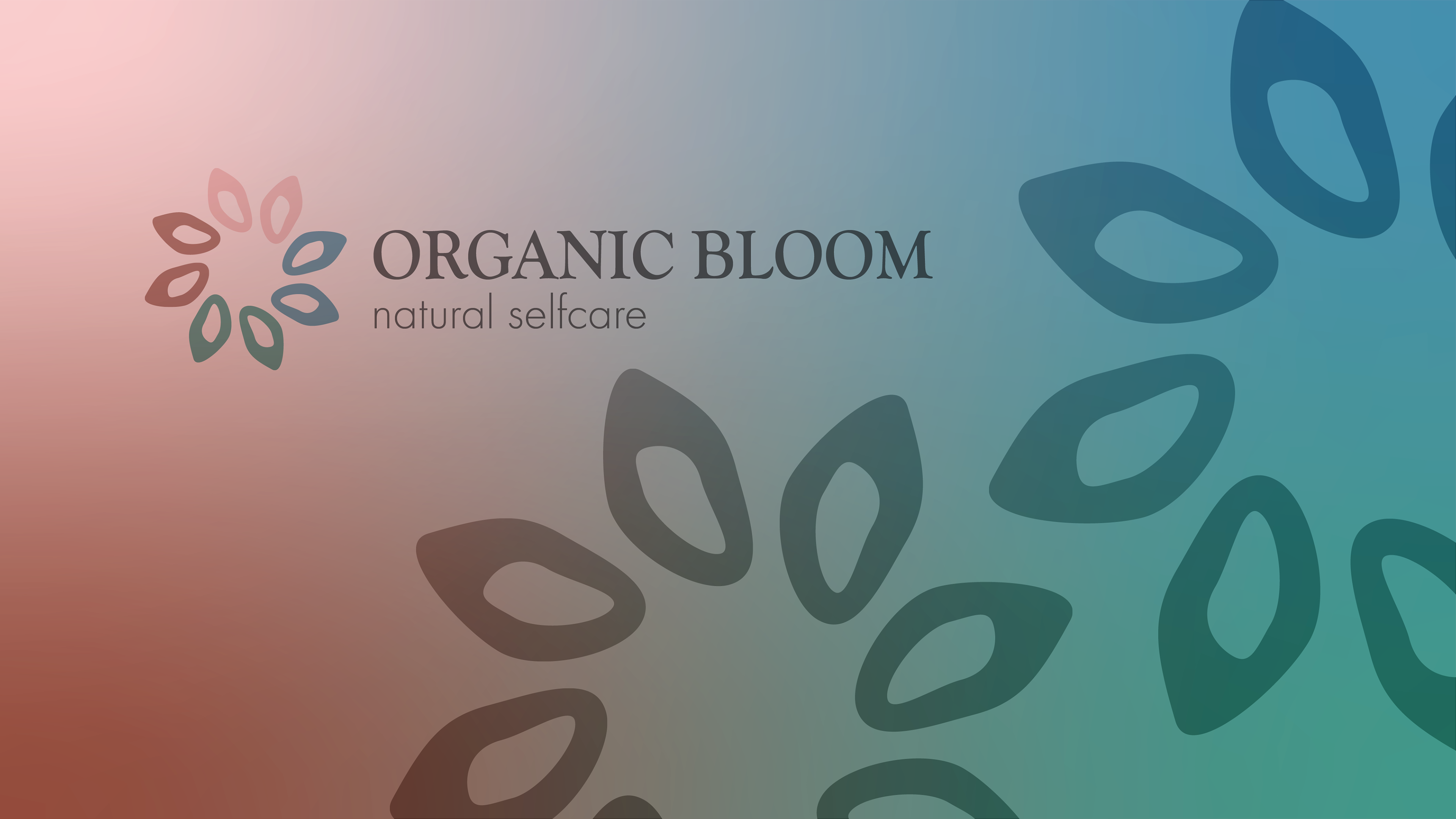
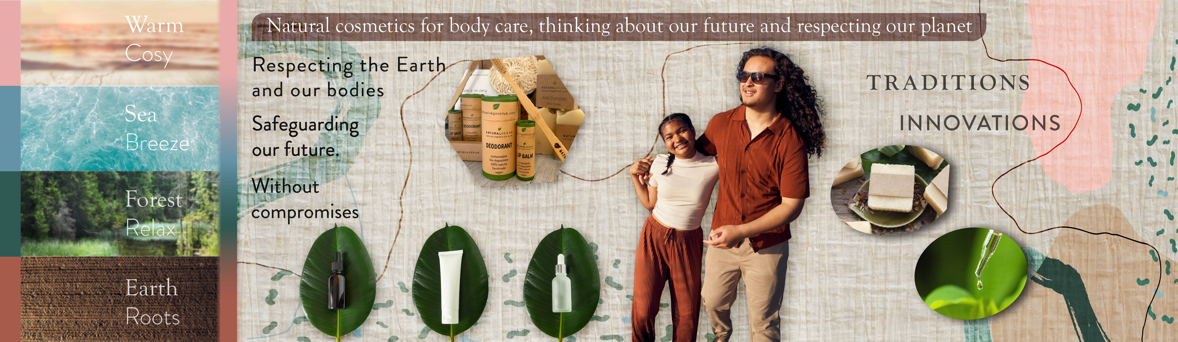
Organic Bloom is all about bringing the freshness of nature to your skincare routine, and we can't wait for you to try our products and experience the difference for yourself. Anew line of organic cosmetics that combines the best of innovation and tradition, taking inspiration from the freshness of the forest, the invigorating sea breeze, the nurturing earth and roots, and the warm and cosy feeling of being at home. With products designed for both men and women, as well as unisex options, a brand that is all about being natural, fresh, and pure.
About the concept
Organic Bloom is a new line of organic cosmetics that combines the best of innovation and tradition, taking inspiration from the freshness of the forest, the invigorating sea breeze, the nurturing earth and roots, and the warm and cosy feeling of being at home. With products designed for both men and women, as well as unisex options, is a brand that is all about being natural, fresh, and pure.
Typography
GOUDY OLD STYLE was created in 1925 by FREDERIK W. Goudy. For the design he was inspired by 16th century Italian characters. This typeface was chosen because of its modern proportions and good legibility. It recalls classicism and tradition without looking outdated and old. It communicates organicity, reliability and recalls natural and wise methods without falling into didacticism. It should only be used for logotype and heading.
Regular Aa Bb Cc Dd Ee Ff Gg Hh Li Jj Kk Ll Mm Nn Oo Pp Qa Rr Ss Tt Uu Vv Ww Xx Yy Zz 1234567890
Bold Aa Bb Cc Dd Ee Ff Gg Hh Li Jj Kk Ll Mm Nn Oo Pp Qa Rr Ss Tt Uu Vv Ww Xx Yy Zz 1234567890
Extra Bold Aa Bb Cc Dd Ee Ff Gg Hh Li ]ị Kk LI Mm Nn Oo Pp Qa Rr Ss It Uu Vv Ww Xx Yy Zz 1234567890
FUTURA is a geometric sans-serif typeface designed by PAUL RENNER and released in 1927, which made 'honest expression of technical processes. Futura has an appearance of efficiency and forwardness, which is why we chose it as a typeface and give it a technical and more scientific feel on the payoff, so as to combine scientific clarity without seeming aggressive in the font shapes. The commemorative plaque left on the Moon in July 1969 features text set in Futura. Without seeming aggressive in the font shapes, it can be used for body text and product descriptions.
Light Aa B6 Cc Dd Ee Ff Gg Hhli Ji Kk Ul Mm Nn Oo Pp Qg Rr Ss Tt Uu Vr Ww Xx Yy Zz 1234567890
Bold Aa Bb Cc Dd Ee Ff Gg Hh li Jj Kk Ll Mm Nn OoPp QaRrSs TtUuVvWw Xx Yy Zz 1234567890
Extra Bold Aa Bb Cc Dd Ee Ff Gg Hh li Ji Kk LI Mm Nn 0o Pp Qq Rr Ss Tt Uu Vv Ww Xx Yy Zz 1234567890